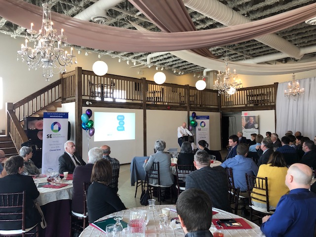
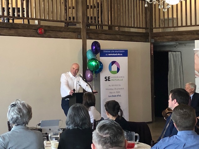
For our 80th birthday, we decided it was time to update our look. The addition of the Company’s brokerage business in 2018 has expanded our reach into the northern parts of New Brunswick. We wanted to break away from the geographical restriction that “SouthEastern” implies, while also more accurately representing who we are. So, we trimmed our name to SE Mutual and got some fresh colour!
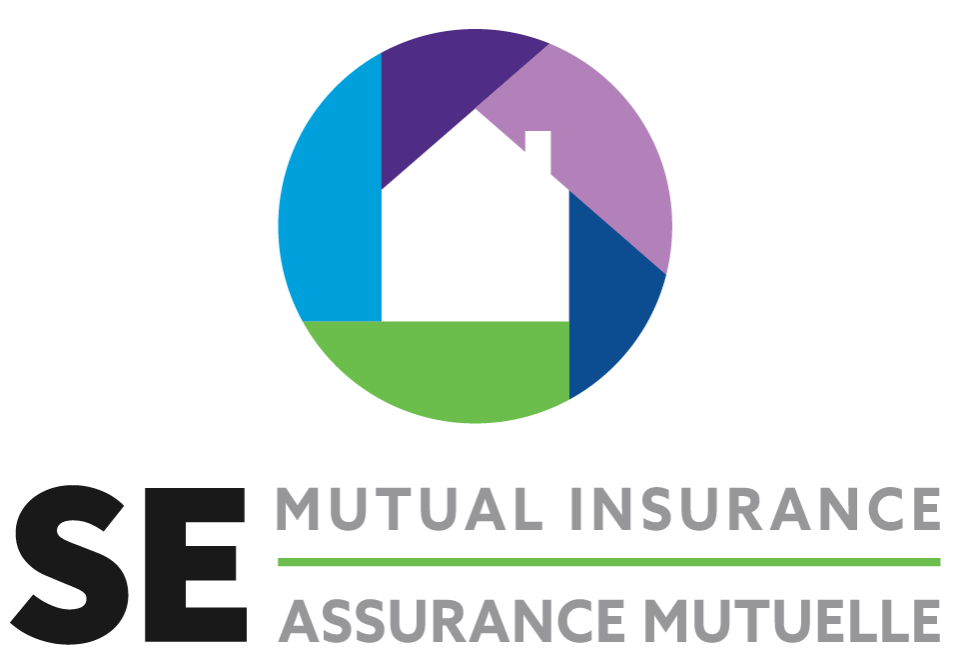
Our new logo symbolizes the vision statement and core values of SE Mutual. Every colour and the middle image each have their own significance.
Dark blue: Organization and Innovation.
Embracing change and the opportunities it creates to provide high value to our members. Dreaming big and using innovative ways to be an industry leader.
Green: Community and Sustainability.
Supporting local communities and groups through financial giving and volunteering.
Light blue: Honesty.
Keeping our promises and committing to do business with ethics, consistency and fairness.
Dark Purple: Service and Protection.
Developing new and innovative products that allow us to provide exceptional service to our clients, while protecting what matters most to them.
Light Purple: Responsibility.
The importance of long-term financial stability along with the sound management of the organization’s assets.
House image: Unity.
The strength of our organization is our people: members, directors, employees, agents, brokers and business partners. The house represents our mutual commitment to helping members put their lives back together when they need us the most.
Read our Press Release– April 30, 2019


